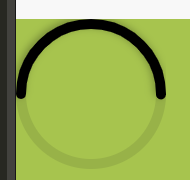
效果图
代码块
<view style="width: 100%;height: 400rpx;background-color: #A7C44E;">
    <div class="percent">
        <svg>
            <circle cx="75" cy="75" r="70"></circle>
            <circle cx="75" cy="75" r="70" transform="rotate(-180 75 75)"></circle>
        </svg>
    </div>
</view>
.percent {
    position: absolute;
    width: 150px;
    height: 150px;
    /* border-radius: 50%; */
    z-index: 666;
}

svg {
    position: relative;
    height: 150px;
    width: 150px;
}

svg circle {
    width: 100%;
    height: 100%;
    fill: none;
    stroke-width: 10;
    stroke: rgba(18, 18, 18, 0.1);
    stroke-linecap: round;
}

svg circle:nth-child(2) {
    stroke: #000;
    stroke-dasharray: 440;
    stroke-dashoffset: calc(440 - (440 * 50) / 100);
    filter: drop-shadow(2px 2px 4px rgba(0, 0, 0, 0.3));
}
简要解析
- circle是圆环的渲染,上面的是底层,下面的是顶层黑环
- cx、cy为显示位置,r是直径,默认会偏移5px,所以默认r=cx|cy - 5
- transform="rotate(-180 75 75)"是将圆环的起点放置左中位置,默认不加这个就是右中位置
- 顶层黑环的总长度为 stroke-dasharray,数值为440的算法是这样的 ? = 2πr ,因此 2 × 3.14 × 70 = 439.6 ≈ 440
- stroke-dashoffset是顶层黑环的进度,算法是这样的 calc(440 - (440 * [进度]) / 100) 进度多少就写多少
- filter: drop-shadow是顶层黑环的阴影,可加可不加
注意事项
- 仅在浏览器端测试有效,UniAPP的iOS不生效,其余未知
评论已关闭